PlayStation 5: Let’s Talk About Its Design
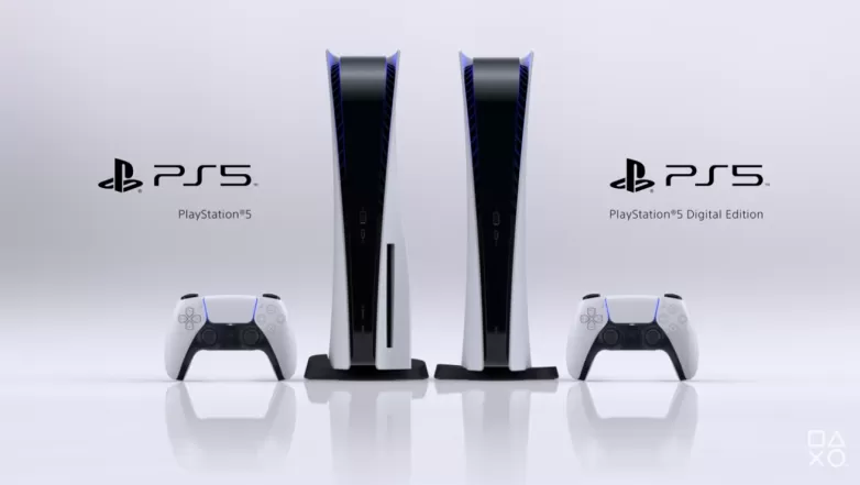
Sony unveiled its upcoming gaming console, The PlayStation 5, yesterday during the Future of Gaming event. The company also showcased a bunch of games among which were 9 exclusives, which is worthy of a praise. The end of the event was reserved for showing the console in all its glory and, well, the PlayStation 5 does look original, no doubt about that. But its design looks like something from 2006. As if designers found a sketch of a rejected PS3 design and went with it. Let’s talk about it.

PlayStation 5 Design Is Unique But Is It Pretty?
The asymmetrical looks of the version that comes with a disk drive attack all OCD-related parts of our body. It’s uneven, with one side being much thicker than the other. And even the discless version, the all-digital PlayStation 5 (which we hope will sport noticeably lower price) isn’t really, you know, pretty to the eye. Those huge cooling fins and wavy spikes above them look like a giant shirt collar. They aren’t only lacking in looks but also function. While they should keep the console nice and cool, they will let through tons of dust, choking the coolers inside the console. Maybe Sony put dust filters behind the cooling fins? That would be great, but it’s highly unlikely.
I knew it looked familiar
byu/jonhak28 inplaystation
Yes, you can place the PlayStation 5 horizontally. But even in that position it looks weird. All wavy and without a definite form. And that color choice. A color combination of an Alienware PC that only lacks RGB effects to go all-in on the aggressive gaming design. A console is something you put under your TV. Something that should be invisible, unobtrusive. Say what you want about the Xbox Series X but that thing has a cold industrial design that fits great under the TV. Yes, you can mistake it for a fridge but it’s better that way than for it to scream “look at me” to everyone who enters the room.

You can't unsee it. #PlayStation5 pic.twitter.com/oMidxcSCg8
— Jared Petty (@pettycommajared) June 11, 2020
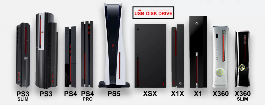
And it looks like the PlayStation 5 is quite chunky. It’s quite tall and isn’t actually slim. Compared to other consoles from the past it towers above them, like the Sauron’s Tower. Some Tweets compare its looks to a duck’s beak, which is hilarious but not that far out. Maybe it’ll be better in some other color? I don’t know, the all-black mockup is still far from being a utilitarian device that only plays games. Oh well, at least the black version (if Sony decides to release one) won’t be visible during the night. It’s something. Maybe the Slim version will walk the unassuming path.

