Dragon Age: The Veilguard Review - Infantile Banality
Dragon Age series was started by a group of people that loved tabletop Dungeons and Dragons and wanted to translate the experience into a computer video games form. By the time the first Dragon Age game was released they’ve already made Baldur’s Gate, Knights of the Old Republic and Mass Effect. Bioware, at the time, was heralded as the studio that innovates and releases the best Role-Playing Games in the world. Complexity of inter-character relations, tackling serious topics in their stories and choices that change the course of the story is what made their games universally loved. Dragon Age: Origins, the first game in the series, was their attempt at a spiritual successor to Baldur’s Gate.
We had to wait for a full decade to see the sequel to Dragon Age: Inquisition. In that time none of the original creators of Dragon Age stayed in Bioware and the company released two games that were both big disappointments.
Back at the End
The decision to continue the story of a game that many haven’t played for years seems baffling. Especially since there’s a whole new generation of gamers that don’t even know what Dragon Age is or why they should care for Solas, Varric or Harding. Yet here you are, attempting to prevent Solas from destroying the Veil. You are Rook, companion of Inquisition’s Varric and Harding, experiencing the pinnacle of Dragon Age Inquisition’s story arc in the first minutes of Veilguard.
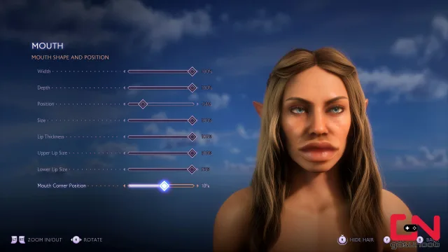
The game starts with an incredibly detailed and fulfilling character creator. Despite the cartoony graphical style it lets you come up with almost any character you can think of. It took almost an hour just to go through all the available options. After choosing my class and even customizing the basic choices of the previous game, that will shape some story parts of this game, I had my Elven Speellblade mage ready for some adventure.
First half of Dragon Age: The Veilguard takes you on a journey around Thedas to assemble a team of companions that will help you take down the old Elven Gods in the second half of the game. Within the first five hours you’ll start noticing several patterns that will only become more prominent as you progress through the game.
Action Adventure
Combat is very action oriented. You’ll always be attacked by multiple enemies, and you’ll have to dodge all the time while landing light and heavy attacks or blocks and an occasional skill and spell combo from your companions. What makes fights hectic is constant teleportation of enemies and losing target lock. In action-oriented style of combat, like in Veilguard, target lock is essential and their decision to design it this way frustrated me to the point of hating it with a passion.
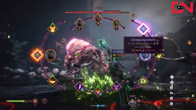
Bad visual cues and sluggishness of movement and animations only further frustrate the player. In the age after games like Elden Ring or God of War having this kind of combat and movement feels like it was made by an AA indie studio. They tried their best, but everyone knows it could have been much better.
Luckily there’s an expansive skill point system that will let you tune your character’s combat effectiveness and abilities to your liking. Itemization is simplified and hinges on upgrading Caretaker’s workshop that will cause the level and quality of items that drop in the world to raise. I had to do very little thinking about which weapon I’m using and just cared about getting + on my gear through the Caretaker. Much like one would in a looter shooter game, for example.
Condescending
During combat your companions will constantly send positive reinforcement messages your way. Good job Rook! Way to go Rook! Every fight, every killed enemy. After a while I started thinking the game thinks of me as an emotionally unstable toddler that would throw a tantrum unless they’re validated.
These constant positive reinforcement messages prevail through the dialogues and the story. Everyone will be super supportive of each other to the point of being almost caricatures of real people. They are unnecessary in such volume and give the game a tone as if it wants to prevent people from feeling bad at all times. Maybe a good environment for a kindergarten, but hardly appropriate for RPG that’s supposedly set in a dark fantasy world.
Bioware has no faith in the ability of its players to handle bad thoughts or feelings or even hard puzzles. This condescending approach to its audience becomes offensive rather quickly.
Banal
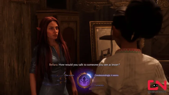
Famous Bioware dialogue wheel is present in its full glory with options now having emoji type icons to make it even clearer what type of dialogue option you’ll be choosing. I didn’t feel like it mattered much though. Tough guy answers options still felt affirming. Guides on the internet say that having the best ending depends on how many quests you’ve finished and how much reputation with factions you have grinded out. Not which conversations options you chose. I found it funny whenever sad and panicky dialogue options (with appropriate crying eye and yelling with exclamation points emojis) were available. Emotionally extreme savior of the world. Now there’s a sight to behold.
The game failed multiple times to connect the seriousness of the situation the characters are in with its dialogue though.
You’ll be rescuing one of your companions from an underwater prison he’s been in for a full year. His nickname is the god killer. You arrive at a room where a cutscene, that’s supposed to be cool, plays and with that you’ve rescued him. There’s no build-up. There’s no mystery. You just rescued a god-killer from a prison he’s been in for a year and it took all of 2 minutes.
Choose an aggressive line of dialogue when talking to some sort of lich that is kidnapping endangered gryphons, and you’ll get one of the stupidest lines written in video games: “Leave those animals alone. They are not yours.” Well said Rook. That will stop him.
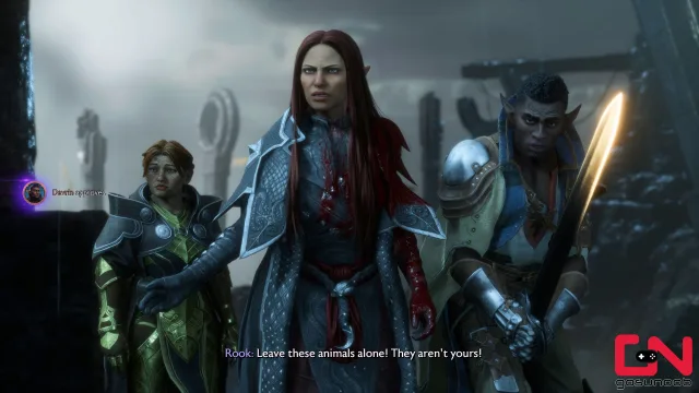
During some cutscenes characters will go from extremely serious feelings and discussions to lighthearted flirting in a millisecond. Talking to a Grey Warden about his death wish turns into lighthearted banter from one sentence to the other.
Pretty Looking
This is especially unnerving because of the AI generated facial animation in dialogues. Face expressions tend to be over exaggerated at times. But what’s worse is that they’ll express two diametrically opposite feelings one after the other. It makes the characters feel psychotic at times. Luckily, this only occurs in about 10% of cutscene material, but I’m still scared every time I talk to Bellara.
There are also lip sync issues that are rather prominent. I’ve also noticed that the game will use an angle where the camera focuses on the listener of the dialogue. Listener does not emote and is just listening. The deliverer of the dialogue is hidden off camera. This trick obviously helped them with reducing the number of cringe facial animations.
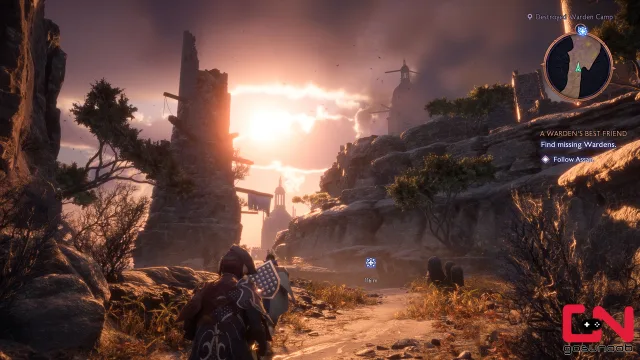
Graphical style of the game is surprising for a fantasy game. It’s lighthearted and almost caricatural. A blend of World of Warcraft and Fortnite. It would fit nicely into a DreamWorks Animation movie. It gives a cheery tone to the game in line with the constant positivism of the narration. Whether that’s good or bad is a matter of taste and preconceived notions, so I won’t be judging it based on that.
In a technical sense it’s fantastic. Frame rate is excellent, and details are amazing. Some of the world is absolutely stunning to look at. It’s’ a pity that you’ll spend most of the time looking at corridors and generic looking dungeons. There is obviously space for graphical beauty, but the skill to put it front and center is lacking.
Corridors
Level design is basic to the point of being atrocious. There is almost no way of getting lost. The main quest path takes you in a single direction always. Every room that is not part of the main quest path is a simple 2×2 square with frivolous treasure chests and gold pouches. There are sooo many of them. The game throws treasure chests at you constantly. Only a few are hidden behind puzzles and those puzzles are on a pre-school level. Nothing even remotely close to what one would see in Assassin’s Creed, not to mention Zelda games or the like. This makes exploration extremely boring. At least the chest opening animations are flashy enough to be worthy of a pay-to-win mobile game (in case you can’t figure it out this is sarcasm). It feels like this game design would be great for a looter shooter though.
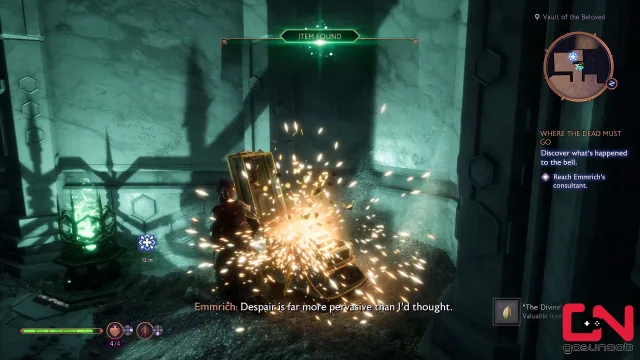
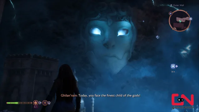
Things become a bit better in later stages of the game when you get to explore various biomes in small open-world fashion, but the level design of these sections is also very simplistic and uninspired that no zone really left a lasting impression. I was thinking the gloomy Necropolis will finally do it for me. Unfortunately, a companion mission that had death as a topic had a Disney level skeleton comic relief character that completely ruined Necropolis for me.
Also, the amount of downhill sliding you’ll do in this game is staggering. Ubisoft’s winter sports game Steep would not be ashamed of this much sliding downhill. Such elements are simply not appropriate for something that’s supposed to be a serious RPG. For example, a dragon is destroying a city, killing thousands, and you’re out here sliding down various slopes and using ziplines. It is as if you’re constantly being anesthetized. Look, a serious thing is happening here, but don’t worry darling – have a little slide and yell “weeeee”. That will make the bad thoughts go away.
Under the Sea
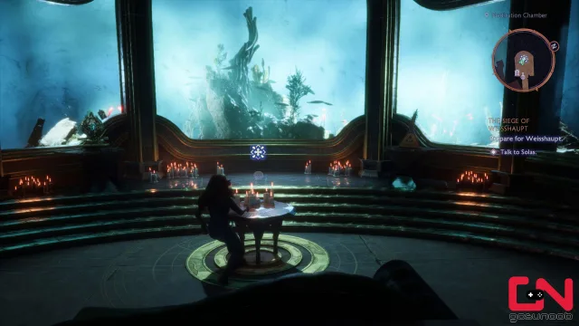
Someone in Bioware environment design team is obsessed with aquariums and underwater landscapes. Once you unlock your room in the Lighthouse, the hub of the game, you realize that it’s underwater. You’re in the Fade, a limbo dimension of sorts, and your room is underwater? How did that happen? Magic! Screw common sense and causality. The important thing is that it looks cool. The important thing is that you can sing “Under the Sea” while decorating your room.
Sufferable
Things start to look up in the second half of the game. I think I started giving up on all my hopes and dreams for this game by this point and that made it easier to play. I got used to the awkward combat system. Stopped caring about the characters in the game. When I found out that the only way to get the best ending in the game is to do every main and side quest and collect all items I started treating it like an Assassin’s Creed game. Mindlessly hoover everything up as you traverse a pretty world and have a mild adrenaline rush during scripted boss fights.
The problem is that Assassin’s Creed games do combat, traversal, puzzles and world/level design so much better than Dragon Age: The Veilguard.
This is all such a shame too because Dragon Age: The Veilguard tackles topics of inclusion and gender identity, probably, the best out of all video games out there.
Happy, Happy, Joy, Joy
Dragon Age: The Veilguard shares no true DNA ancestry with RPGs. It is at best an Assassin’s Creed look-alike, a Hogwarts Legacy wannabe, but its infantile and banal storytelling makes it more of a Roblox game in a grown-ups’ graphics engine.
There’s an argument to be made that this game was made by the new generation for the new generation of gamers. The point of its existence is not to raise and discuss serious topics or explore dark emotions. It’s here to provide good fun. Its target audience seems to be your average high schooler. You don’t want to bother him with topics of racism, religion, oppression, inequality, dogmatism, relationships, social interactions and other big topics previous games in the series tackled. Give him positive reinforcement, fairy-tale cartoonish looking worlds and loot.
I think Bioware thinks very little of the new generation if this is their vision of what a game for them should look like.
That’s why I’m inclined to give it a score of 4/10 but I’m not doing that just because it reflects my disappointment by the fact that this game has taken the Dragon Age name and lore and has absolutely nothing to do with what the original games in the franchise were trying to do. Bioware was not brave enough to release a new IP game because Electronic Arts (correctly) concluded it would not generate enough sales. So, we got a Dragon Age game that doesn’t want to be a Dragon Age game and an RPG that’s not an RPG.
The score below reflects the fact that Dragon Age: The Veilguard’s combat is clunky, uninspired and ultimately boring. That its world design is soulless and plastic and level design simply bad. Veilguard’s storytelling can be fun and interesting at times but there are so many infantile and banal moments that you can’t consider it good. It is a good-looking game with few bugs and 60 hours of content to go through. It can be fun if you have no expectations, but there are so many better and more meaningful games out there that spending money on Veilguard is simply not justified.
Highs
- Solid looking game with good graphics engine and technical performance.
- Hair physics.
Lows
- Treats its players like emotionally unstable toddlers.
- Repetitive and boring combat system
- Bad level design
- Infantile and banal storytelling littered with disjointed emotions.


“After a while I started thinking the game thinks of me as an emotionally unstable toddler that would throw a tantrum unless they’re validated.
No, that’s an accurate description of the writers of this game. That’s how all the edges of Thedas got sanded off, how th character interactions ended up like a corporate HR meeting, ergo, how Dragon Age The Veilguard came to suck.
The score is too damn high.
Loved the review tho.